|

NetKernel News Volume 3 Issue 14
February 17th 2012
What's new this week?
Catch up on last week's news here
Repository Updates
The following updates are available in the NKSE and NKEE repos...
- http-client 2.10.1
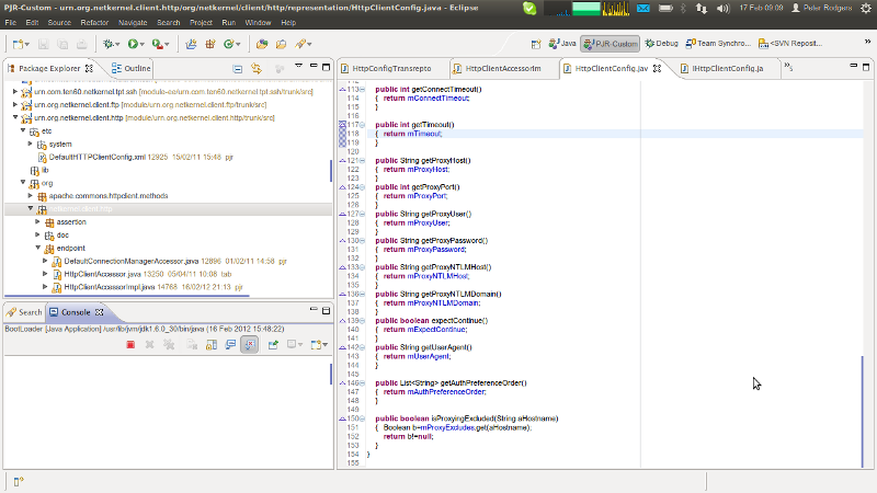
- Adds support for a configuration option to specify the order (and preference) for authentication scheme. Thanks to Glenn Proctor for raising this and providing invaluable diagnosis and testing of the solution.
- Adds support for a proxy exclusion list - to specify a list of hosts for which a proxy server should not be used (ie localhost etc). Thanks to Nicolas Spilman for this idea and for testing the feature.
- lang-xrl 1.11.1
- Official release of XRL with the new async capability (see last week for details)
- pds-core 1.7.1
- Updated to improve cacheability of the RDBMS connection configuration when using the DB-backed persistence service.
- nkse-dev-tools 1.43.1
- Added settings for proxy exclusion list, also now hides proxy password.
- wink-slinki 2.1.1
- All new SliNKi presentations for WiNK with HTML5 slides. (see below)
Tom Latest
Here's the latest from Tom. Please also don't forget that it would be really great if you can lend Tom some time to read/review the current draft of the Practical NetKernel Book.

No doubt Peter's newsletter entry on datastructures has raised some eyebrows so I thought I'd give my 2,5 eurocents (only Belgians will get this) opinion on the matter.
http://practical-netkernel.blogspot.com/2012/02/time-of-tree.html
As always your questions, opinions and ideas for future posts are welcomed at practical<dot>netkernel<at>gmail<dot>com.
SliNKi goes HTML5
Brian Sletten and I have completed a major overhaul of the SliNKi presentation application. You may recall this was first revealed in 2010 and it provides a wiki-based presentation application using WiNK as the foundation.
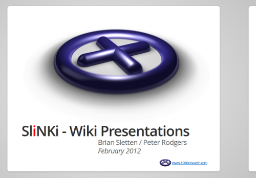
Today's update to wink-slinki provides a brand new HTML5 based engine with smooth sliding transitions and plenty of other HTML5 goodness. As you can see from the image below its night and day compared with the first generation...

We've got a demo presentation, which explains all the details, including how to install and start using it. Take a look.
As a proof of concept I seamlessly switched an old slide-set covering NetKernel Protocol to use the new HTML5 SliNKi. Switching was just a matter of changing the initialisation macro to {slinki} and changing some headings from h1 to h3 to get the same formatting of page titles.
If you used the original slidy technology it is still present for backwards compatibility so upgrading won't break anything. If you want to see how it looked back in 2010 here's an old demo. You'll see that today's release is a huge improvement!
One of the essential features that was always not quite there was printing support. This time, after a lot of research, Brian found a neat trick using CSS mediatype to make printing and export to PDF look pretty good.
Brian is working on a set of WiNK macro extensions to satisfy his serious "presentation habit". The underlying technology is the existing WiNK application (same as this page you're viewing) which is itself just a thin layer over the NK wiki resource model - so its pretty trivial to extend. Lets hope that this next generation SliNKi inspires a whole bunch of new and cool extensions.
SSD - A cautionary tale
About a year ago I moved to an SSD in my laptop. Once you've experienced the responsiveness it gives to UIs and the general speed of everything there's no going back.
Last week, exactly two weeks after the warranty on the disk elapsed - it failed. Not in a small way - in a major, BIOS doesn't even say there's a disk plugged-in, kind of way. Apparently this is not an unusual thing for SSDs - usually they can be "recovered" by re-flashing the firmware - but you will lose all data.
Fortunately all my business critical stuff and source code is always backed up with several tiers of redundancy and I had a failover replacement SSD to swap to - but it was still a lost day of my life to reinstall an OS and get back to square one.
So I highly recommend getting an SSD, but be doubly diligent about backups.
Unity Desktop mini-Review
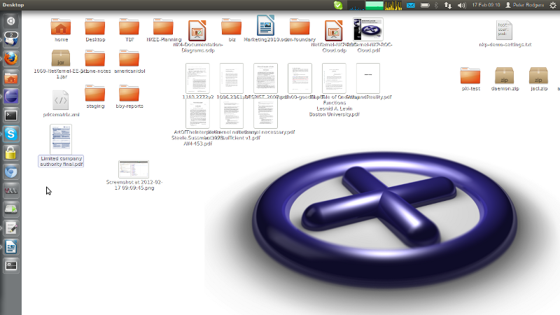
I took the downtime as an opportunity to evaluate the latest Ubuntu 11.10 distro. It now comes with Gnome 3 and the Unity desktop as its "GUI shell".
At first it was disorienting - but then you step back and realise that what they've accomplished is a very neat thing. They've effectively eliminated all redundant use of screen area.
There is a Mac-like universal menu bar so all apps gain at least one display line. Scroll bars are thin subliminal indicators and only show (on the outside of a window) when you mouse near it. Indicator apps are tidy and first-class applications (though still a bit thin on the ground - search for "indicator" in the software center to find those essential things like CPU load views etc).

Out of the box the launcher is way too big and, due to the garish Libre Office icons it has as defaults, looks pug ugly. But it can be easily tweaked to be small and tidy - and it does tuck itself away on the left hand side which, with wide-format displays, frees up even more vertical space for real applications. You also need to read the user-guide for it to learn the tricks (middle button opens another instance of an app was an essential discovery).

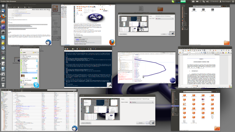
One further thing - this desktop is 3D enabled from the start. Its smooth, uses a good but not overwhelming number of visual cues. Only one thing is missing - the support for the application switcher is an obscure key press away. The Mac-style zoomed out high-level view of apps is irreplaceable once you've discovered it. I had to tune compiz to get back my old style of use. But as a bonus I discovered the Easystroke gesture recognition tool - I am now quite dangerous to be near with my Zorro-style flicks to show all my apps...

All in all - like an SSD - once you get used to it - its a big step forward.
Ubuntu took a lot of flack for their bold design decision. Paradigms need to change and desktop UIs were feeling long in the tooth. As an innate non-respector of paradigms myself, I appreciate the effort it takes to break free of convention - good job Ubuntu team!
Have a great weekend.
Comments
Please feel free to comment on the NetKernel Forum
Follow on Twitter:
@pjr1060 for day-to-day NK/ROC updates
@netkernel for announcements
@tab1060 for the hard-core stuff
To subscribe for news and alerts
Join the NetKernel Portal to get news, announcements and extra features.
NetKernel will ROC your world
 |
